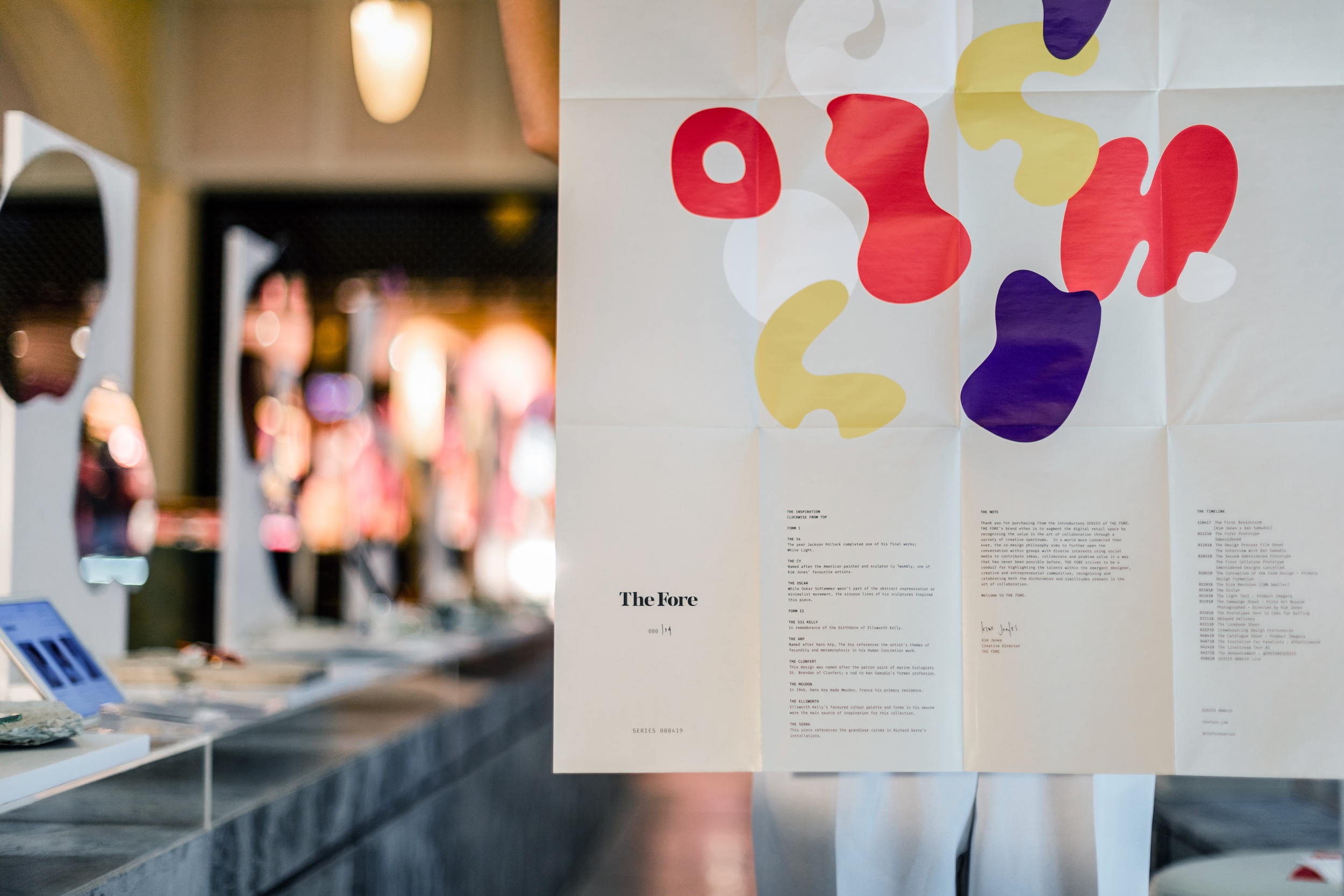
The Fore is a designer gallery and retail space founded by Kim Jones—an artist, model, and creative director based in the Philippines. Positioned as a platform for collaboration and discovery, The Fore showcases a curated selection of designers and artists from across Southeast Asia. Each collection spans different disciplines, mediums, and creative voices, reflecting Kim’s commitment to artistic experimentation and regional representation.
The challenge was to create a brand identity that could remain distinct and recognisable while being open enough to accommodate a wide variety of visual styles. Together We Design collaborated closely with Kim to translate her vision into a flexible yet elevated identity system. My role focused on developing a custom logotype, typeface, and packaging design that would give The Fore a unique signature—while allowing space for creative expression to shift with every project.
John Borras Tan Account Management, Visual Identity, Type Design
Work done with: Together We Design
Design Support: Laraine Gazmen
Photography: Lunar Photography
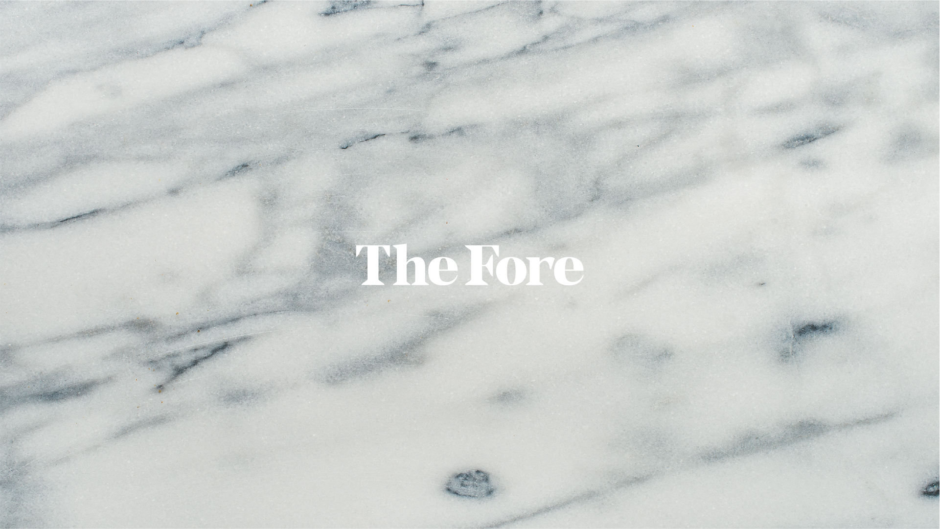
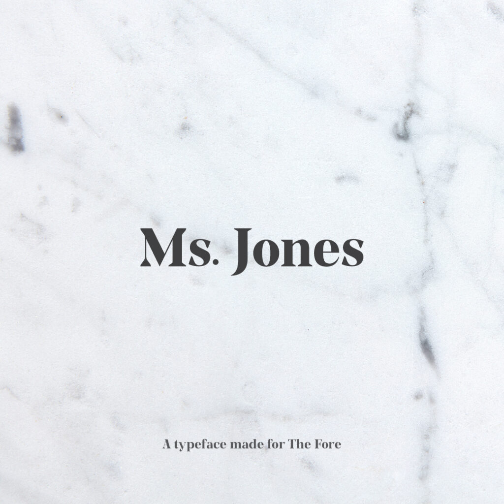
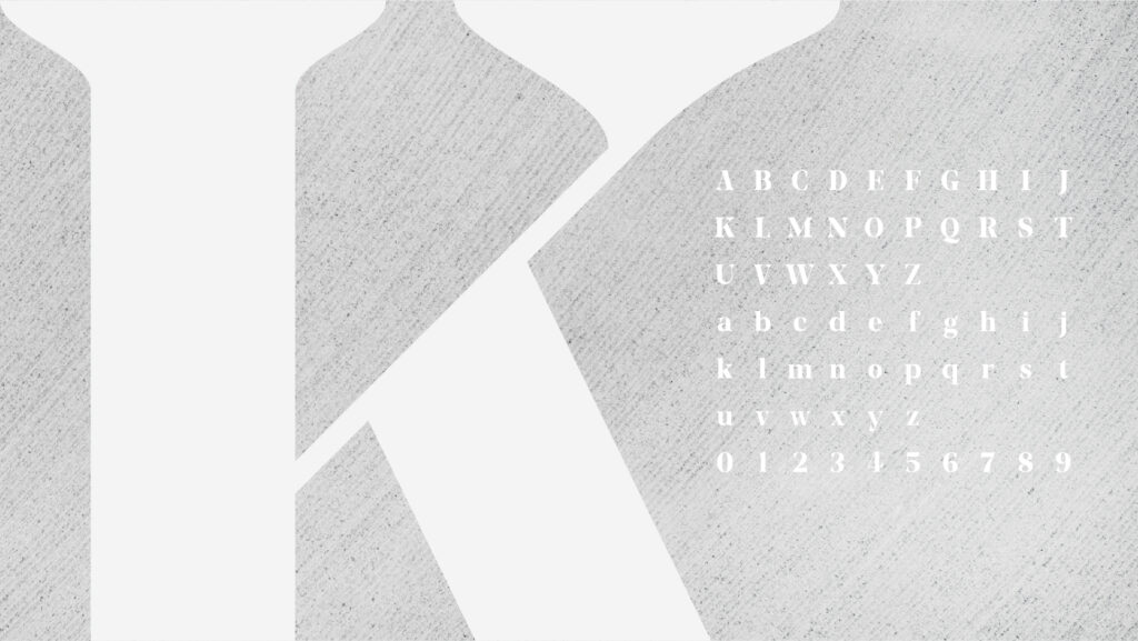
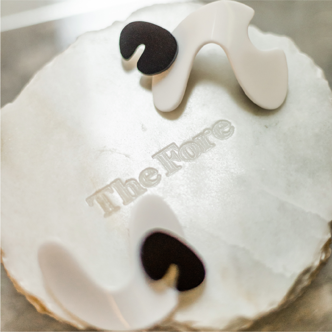
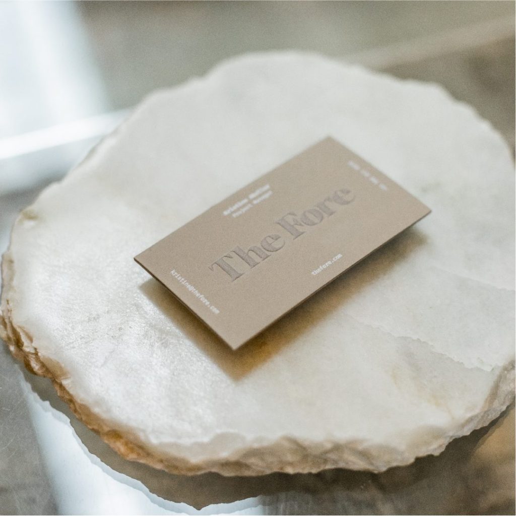
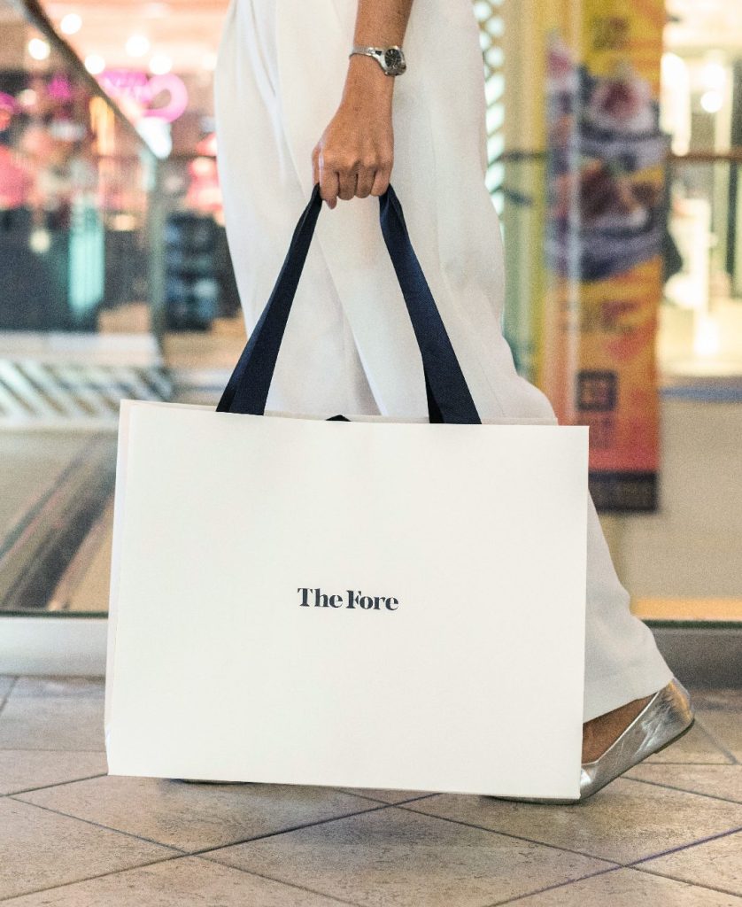
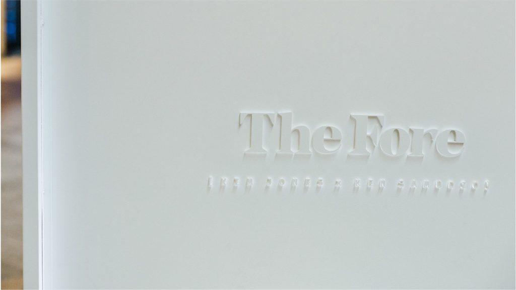
Ms. Jones Bold is a custom display typeface inspired by Fat Face styles such as Bodoni, Normandia, and Noe Display. With strong contrast, graceful curves, and confident serifs, the typeface evokes both elegance and boldness—serving as both the logo and a defining visual element. Its sculptural quality allows it to hold space across different applications without overpowering the work it accompanies.
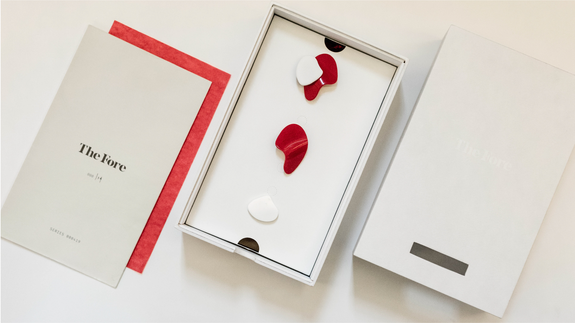
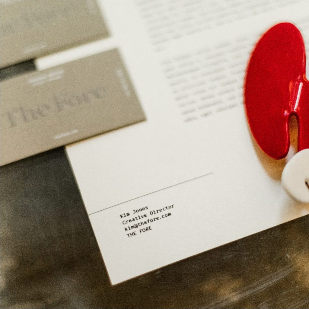
For The Fore’s first collaboration, we extended the identity into a fully custom packaging system. Every detail—from construction to finish—was thoughtfully designed to reflect the brand’s refined, artful approach. The unboxing experience was treated as an extension of the gallery itself, and we oversaw design, sourcing, and production across all physical brand touchpoints.
Our design work provided a grounded yet versatile system, giving the gallery a signature identity that can grow and transform with each new collaboration.