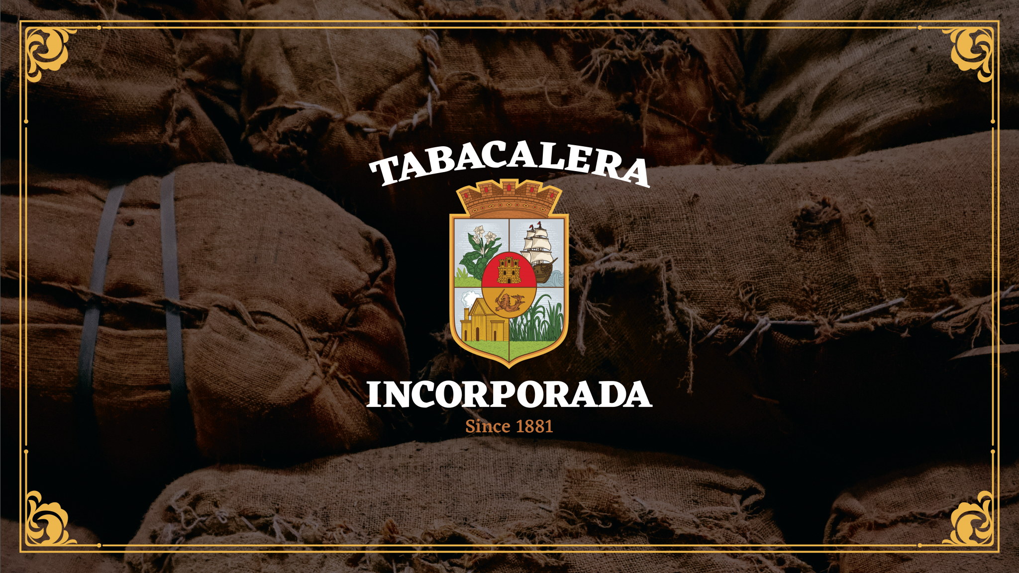
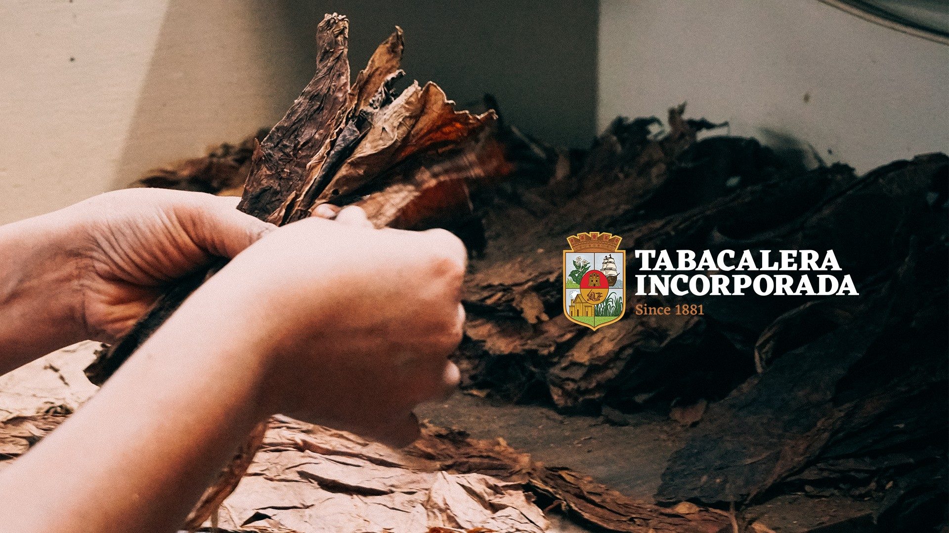
Tabacalera Incorporada is the maker of the finest hand-rolled Philippine cigars since 1881. The first and oldest cigar factory in Asia, and one of the oldest cigar companies in the world. Tabacalera Incorporada has for more than 140 years remained unrivaled in quality, selection, and craftsmanship.
Being family-owned and traditionally managed, their brand refresh was subtle and gradual, taking its time. The objective was consistency and not an abrupt change—an apt approach for a long-standing brand that endorses the luxury of time through its cigars.
John Borras Tan Account Management, Brand Strategy, Design Support, Photography
Work done with Together We Design
Creative Direction & Lead Design: Laraine Gazmen
Copywriting: Isay Roque
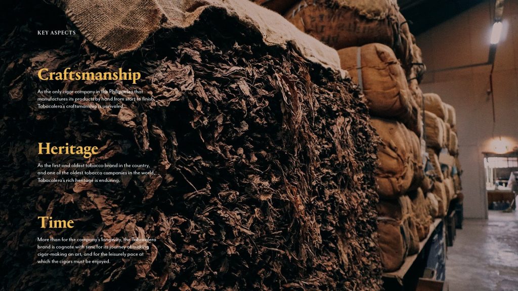
Learning about the brand through interviews with stakeholders and research from their archives, we developed a brand strategy that honoured their legacy while solidifying their identity for the future. We defined a purpose centered on preserving the craftsmanship of Philippine cigars and developed narrative pillars—Heritage, Time, and Craft—to guide brand messaging. These pillars informed the tone of voice, content themes, and visual direction, ensuring the brand would speak with both cultural weight and warmth.
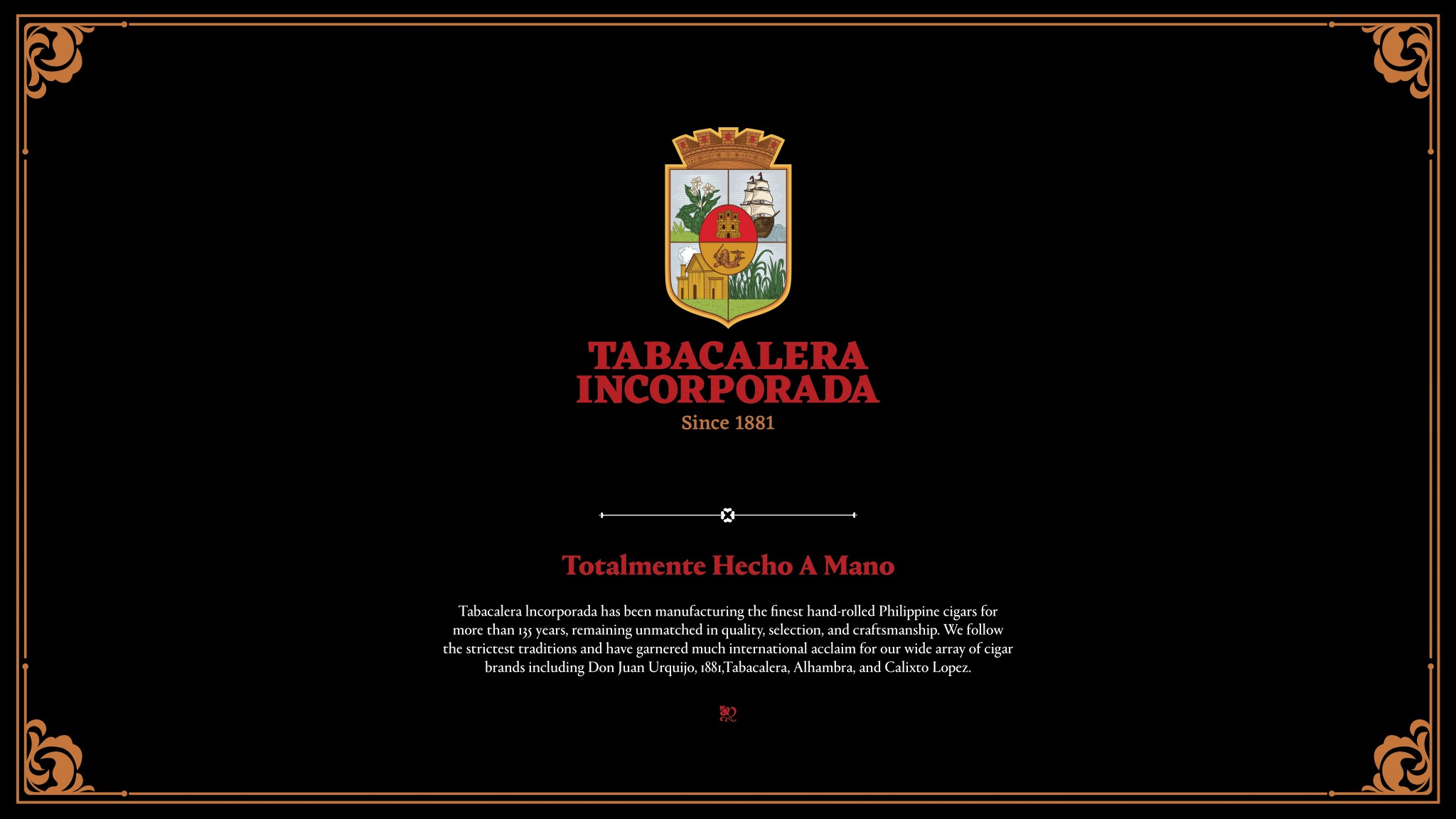
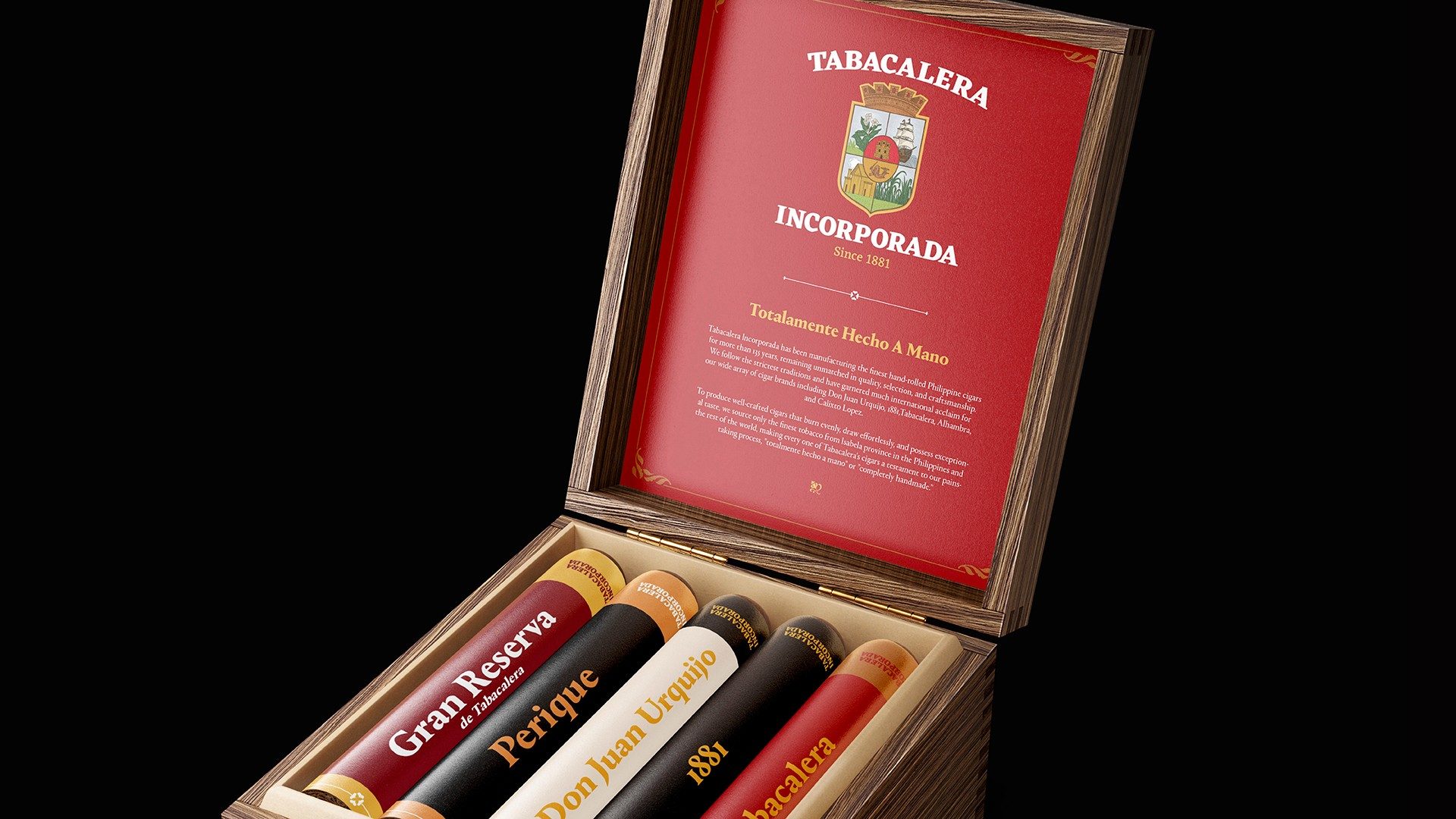
Having been managed by multiple families over the years, Tabacalera had several inconsistent renderings of its crest. We created a refined and unified logo system rooted in the original, preserving its character while improving clarity, scalability, and usability. A full set of primary and alternate lockups were established, each with clear usage rules to ensure consistent application across various touchpoints.
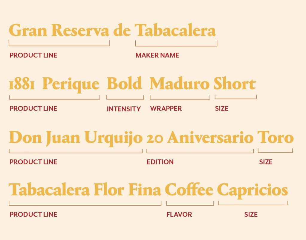
We also introduced a structured product naming system that drew from Spanish terminology and heritage cues to reflect the brand’s history and craftsmanship. This approach ensured product lines were not only distinguishable but also reinforced the brand story—each name acting as a nod to its cultural and artisanal roots.
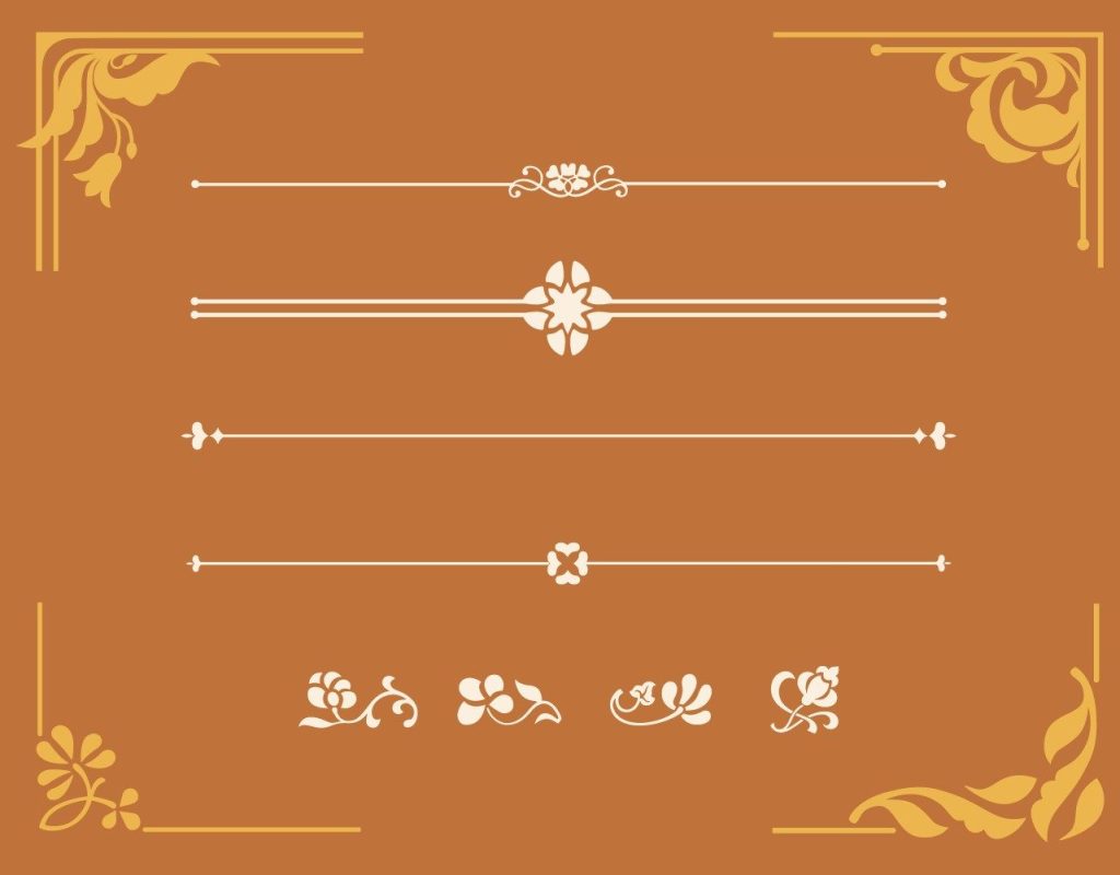
To support this, we built a comprehensive key visual system inspired by the Art Nouveau era and the tobacco plant itself. Custom floral borders, ornate footers, and elegant separators softened the patrician look of the brand while reinforcing its artisanal, heritage-driven identity. Typography was carefully selected to reflect both legacy and readability, paired with a warm, earthy colour palette led by Pompeian red. This system ensured consistency and cohesiveness across all brand expressions.