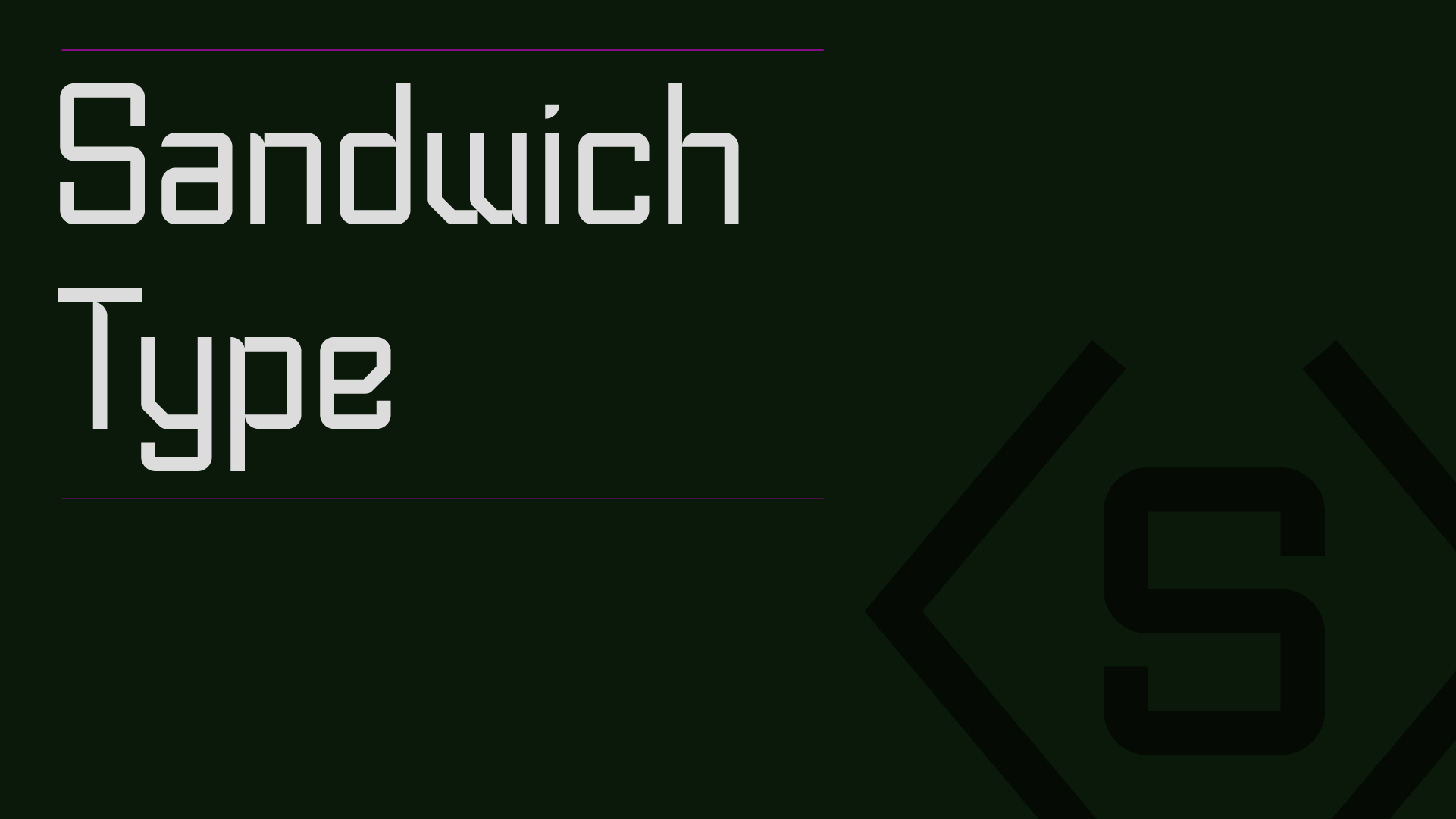
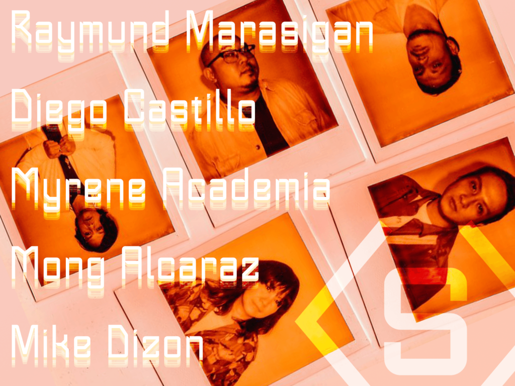
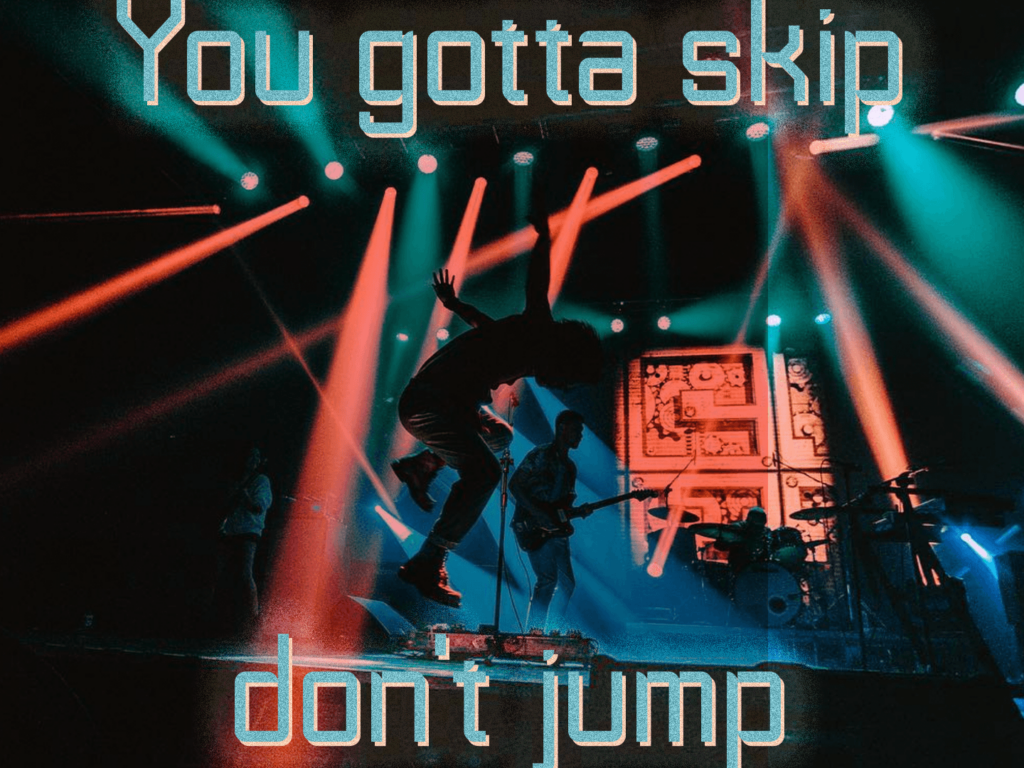
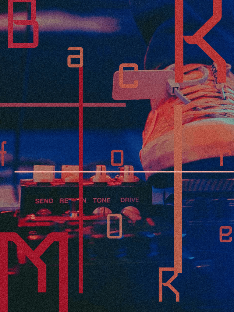
Sandwich Type is a custom typeface for the Filipino rock band, Sandwich. In close collaboration with the group’s lead vocals, Raymund Marasignan, we created a typeface that matches their music. The typeface is also a callback to the aesthetics of the late 90’s to early 00’s.
Since Raymund really liked Bawal Sans, I started to develop this typeface with that in mind. As we talked more about typefaces and letterforms, his idea leaned more towards a minimalist geometric sans serif, with some subtle hints of detail.
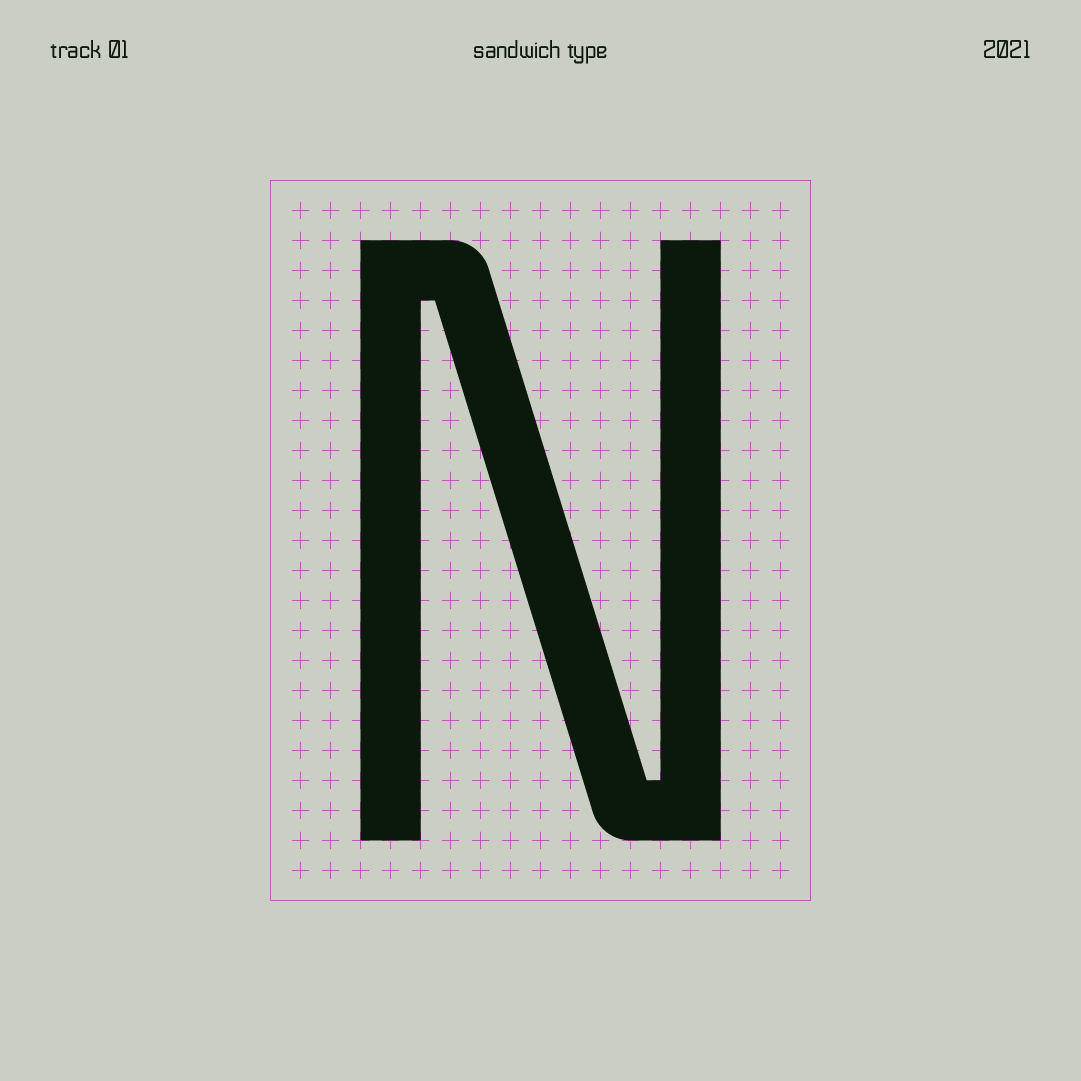
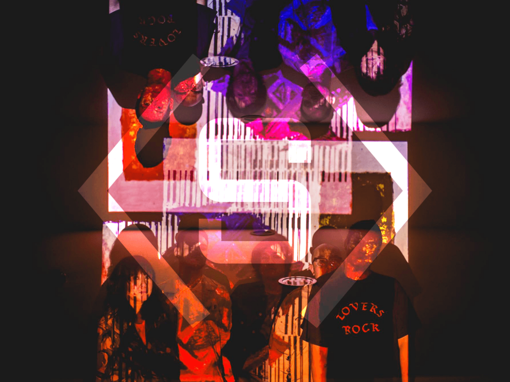
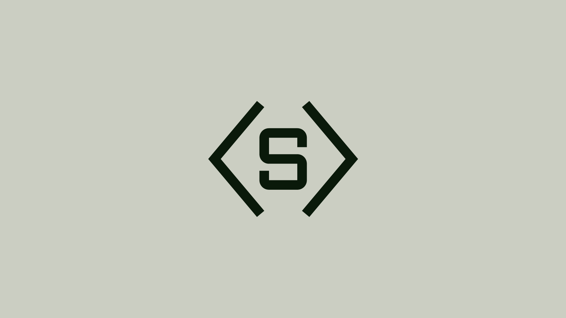
When I was going through my studies with Raymund, he immediately stopped me on this one. He really gravitated to this study and had a good feeling about it — simple but has a lot of character. Later on he realized it looks similar to the logo their set designer manually made for their music video set.
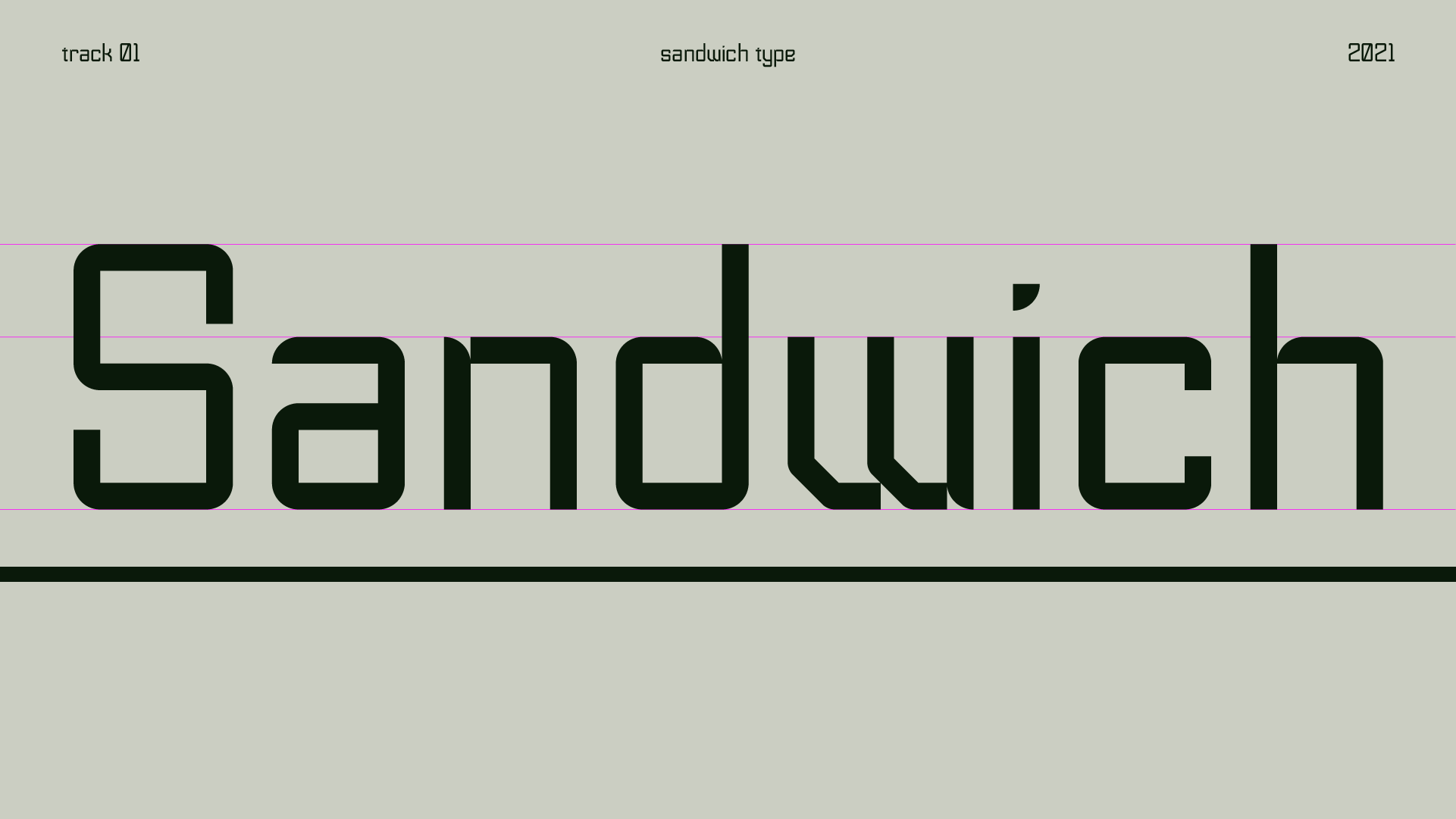
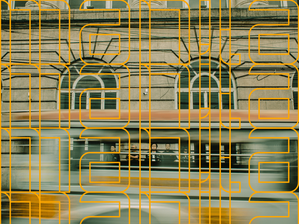
Personally, I think Sandwich Type’s letterforms remind me of the late 90’s and early 00’s, wherein clean geometric forms got experimented on to look more techy, millennium, or grunge even.
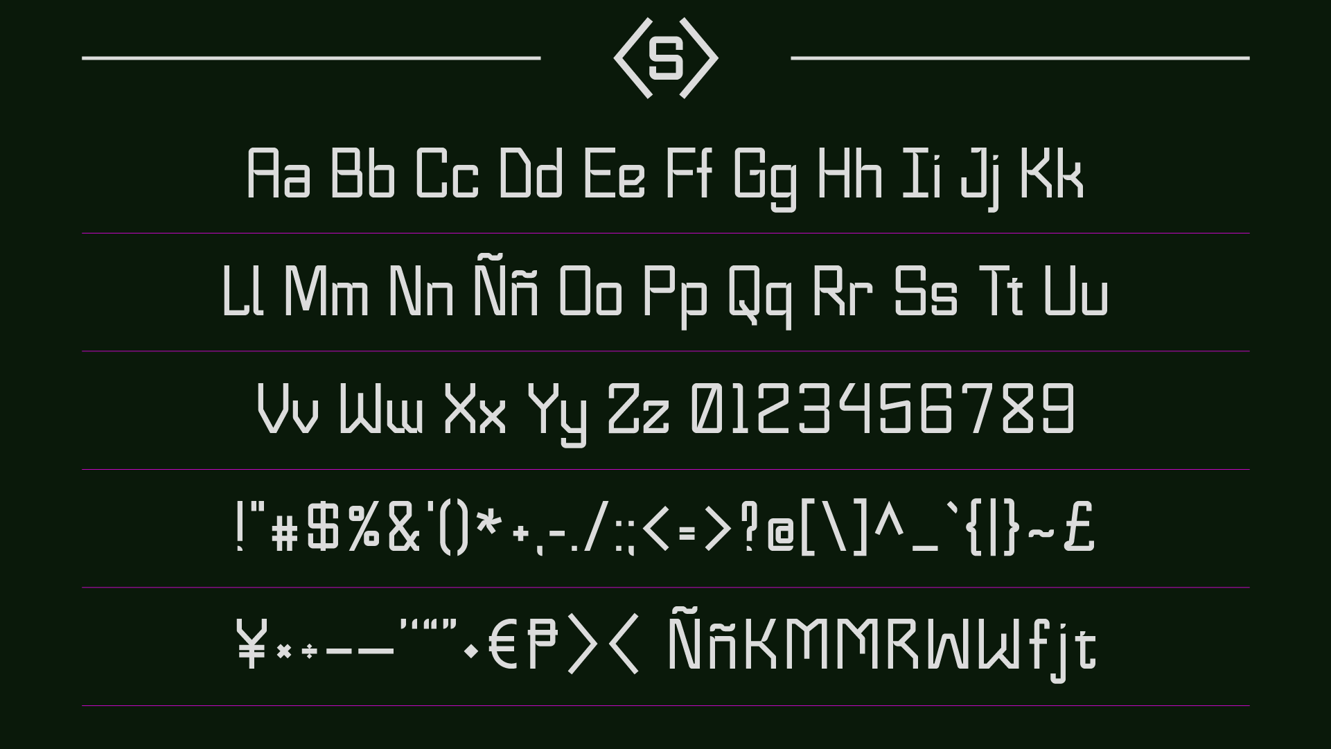
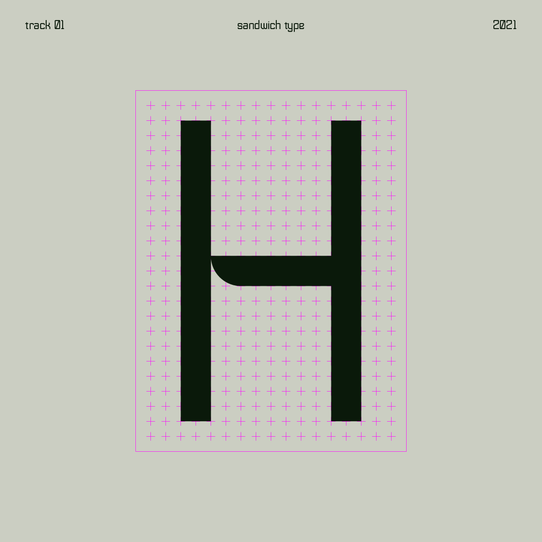
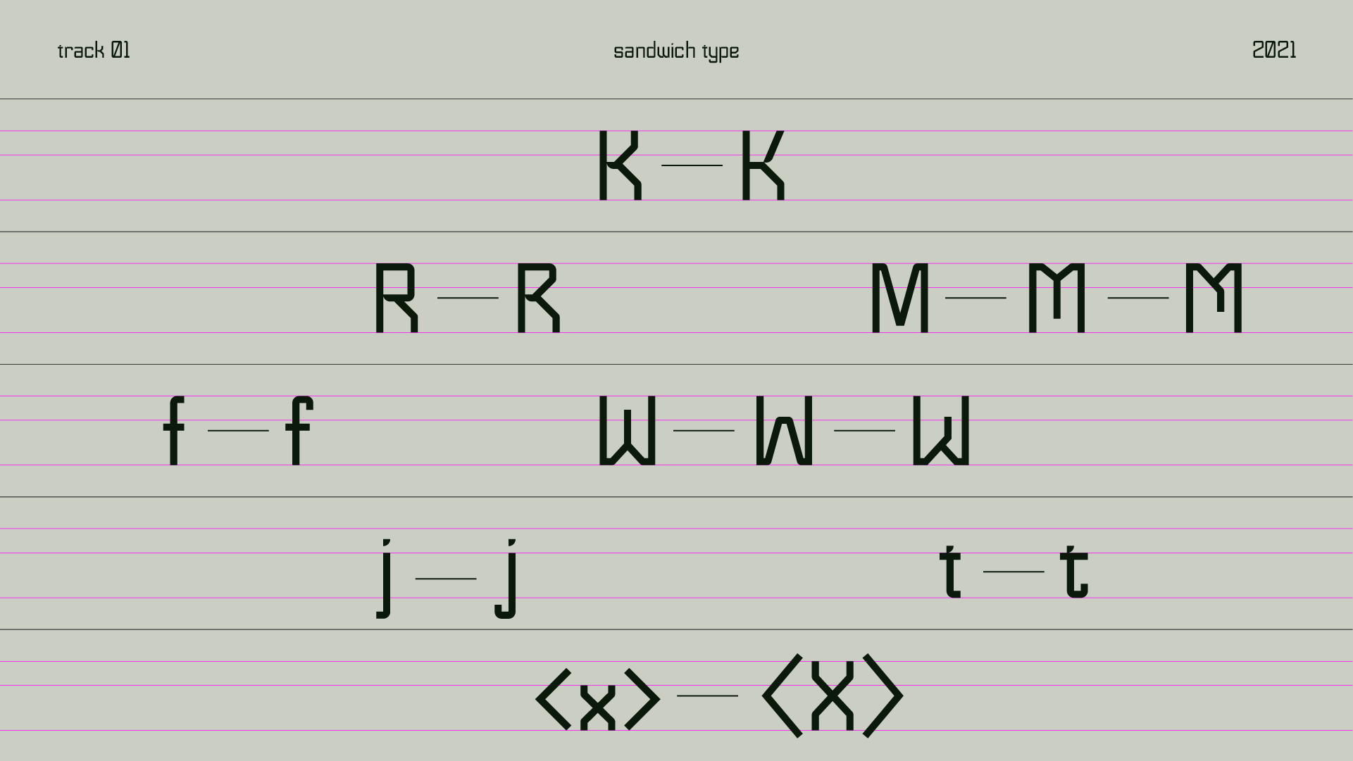
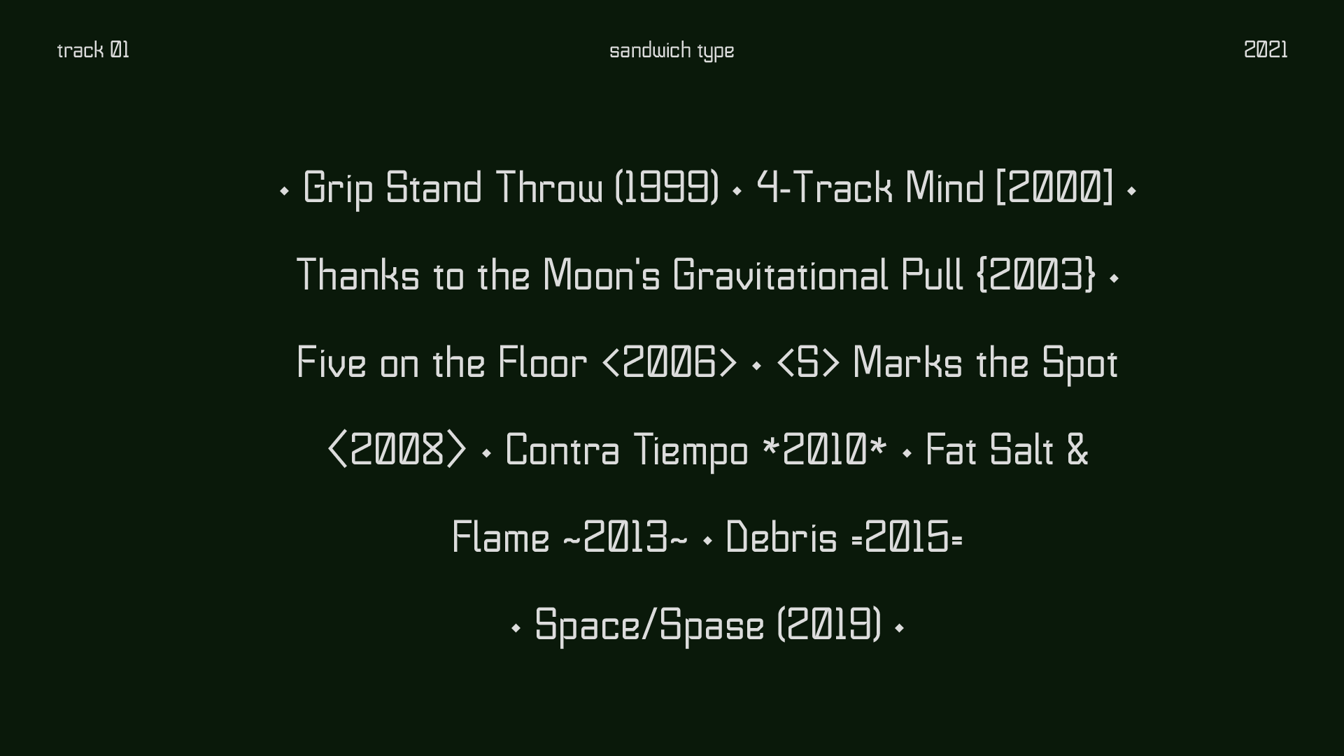
Sandwich Type is based on a rigid grid that forms highly angular lines making “pseudo” inktraps in some letters. Most notable feature is the “<s>” ligature, made specifically for the band’s logo.
Undecided with some letter options, I just included them as alternates. I also created an angular bracket alternate for capital letters.