F-Stop Photo Fair is a grass-roots event organised to celebrate photography of all kinds and skill levels. In collaboration with the teams from Auckland Zinefest and Colectivo Narval (Chile), I created the visual identity system for the event. This effort that started in Auckland is now running in Chile as well.
John Borras Tan Branding, Visual Identity, Creative Direction
In collaboration with Auckland Zinefest (Auckland) Colectivo Narval (Chile)
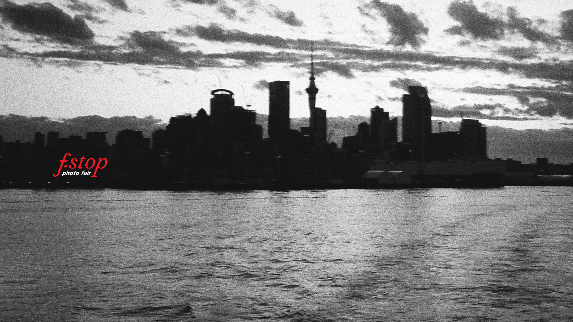
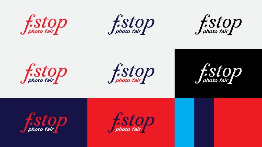
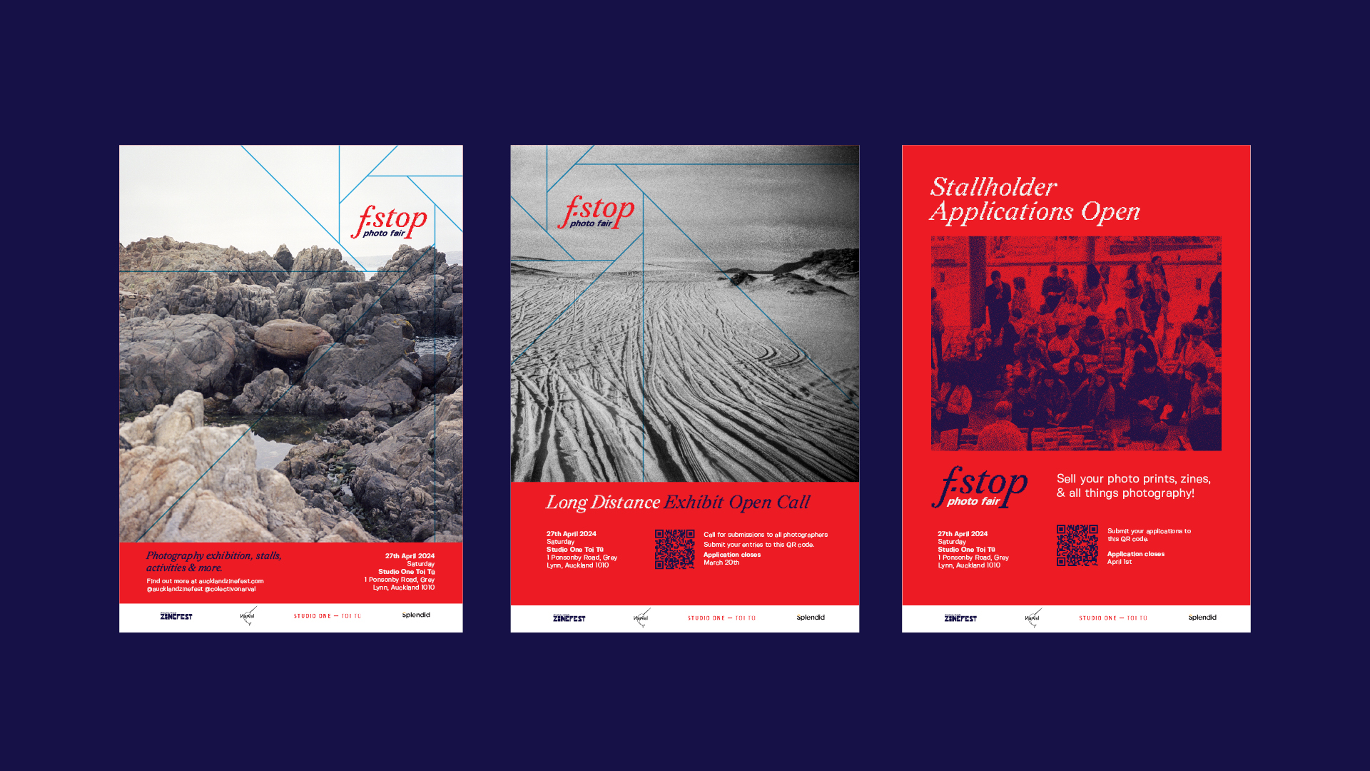
The logo’s italicised serif showcases an elegant letterform. But a closer look at the logo will show its low-fidelity rendering. Much like photographs and images, sometimes artistry comes from something other than high-resolution technology. Low-resolution images and noisy film photos can give off the same sense of beauty and connection.
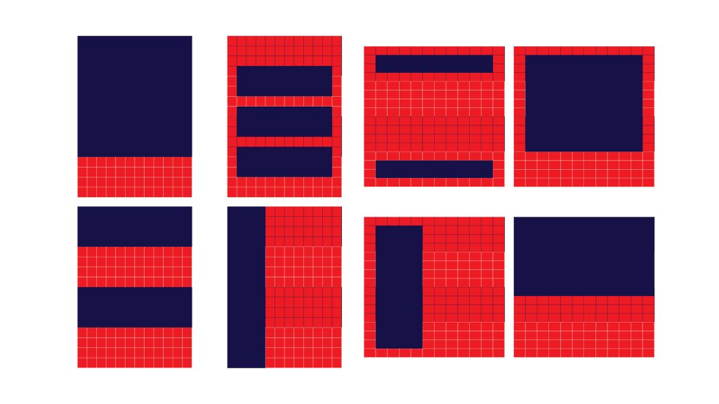
The geometric lines of the camera’s aperture is the event’s main key visual. This functions as a framing device in a composition, highlighting the most critical information or image while directing the eye in a unique visual flow. The lines, in a literal sense, also connect ideas and imagery in a long distance.
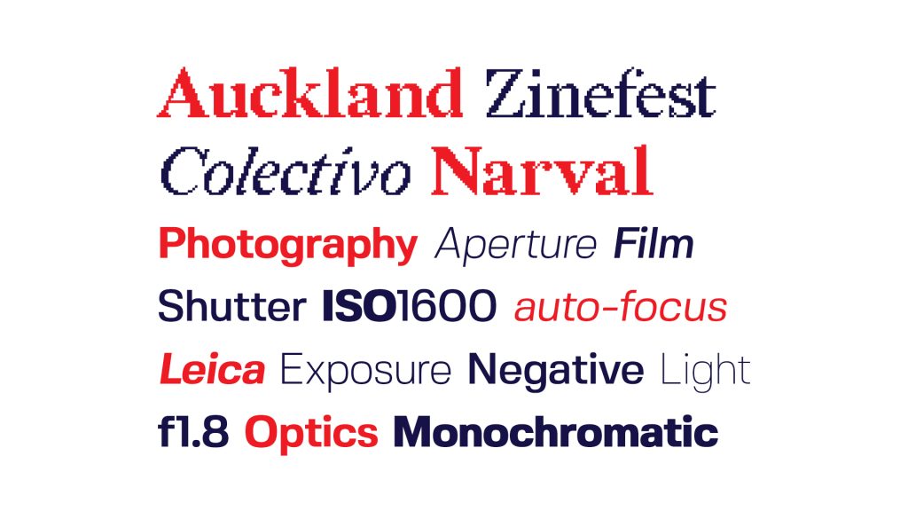
It is gritty and modern while still keeping its elegance. The header uses Redaction 35 from the Redaction family. The body copy uses Fivo Sans, a more geometric and modern typeface alluding to camera inscriptions.
An overarching grid system is used to frame images and information to keep the compositions consistent. The focal lines can then work within those frames.