John Borras Tan
Brand Strategy, Account & Project Management, Identity and Packaging Design Support, Motion Graphics
Work done with:
Together We Design
Brand Identity & Packaging Lead:
Lech Velasco
Design Support:
Lari Gazmen, Mark Gosingtian
Copywriting:
Isay Roque
Photography:
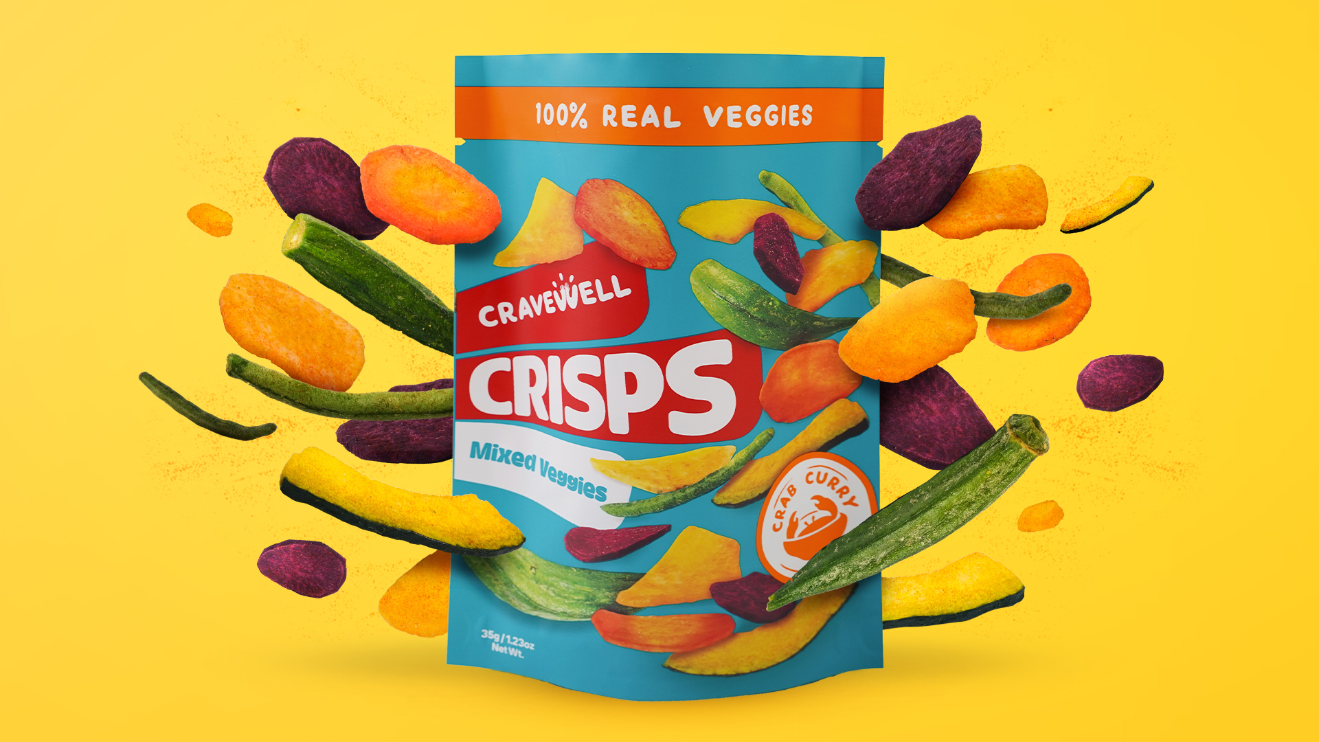
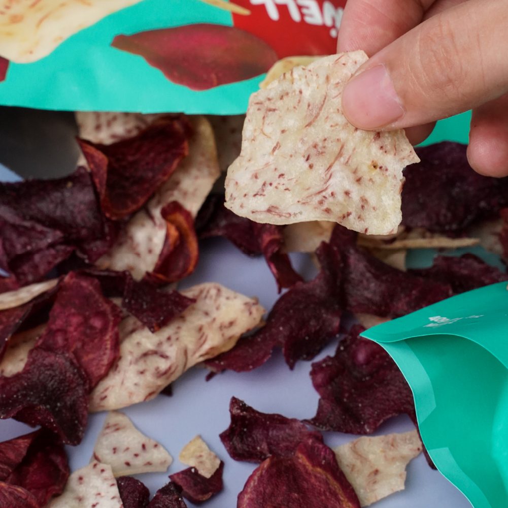
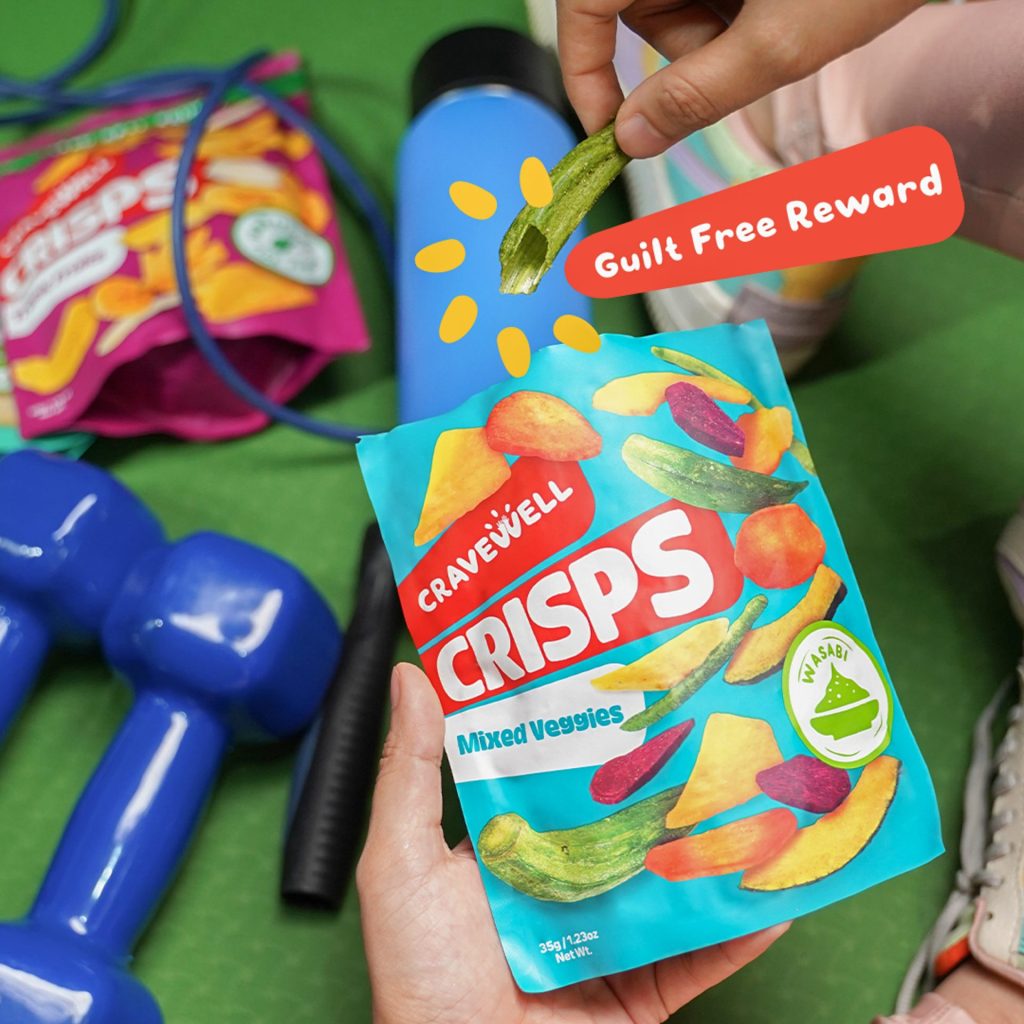
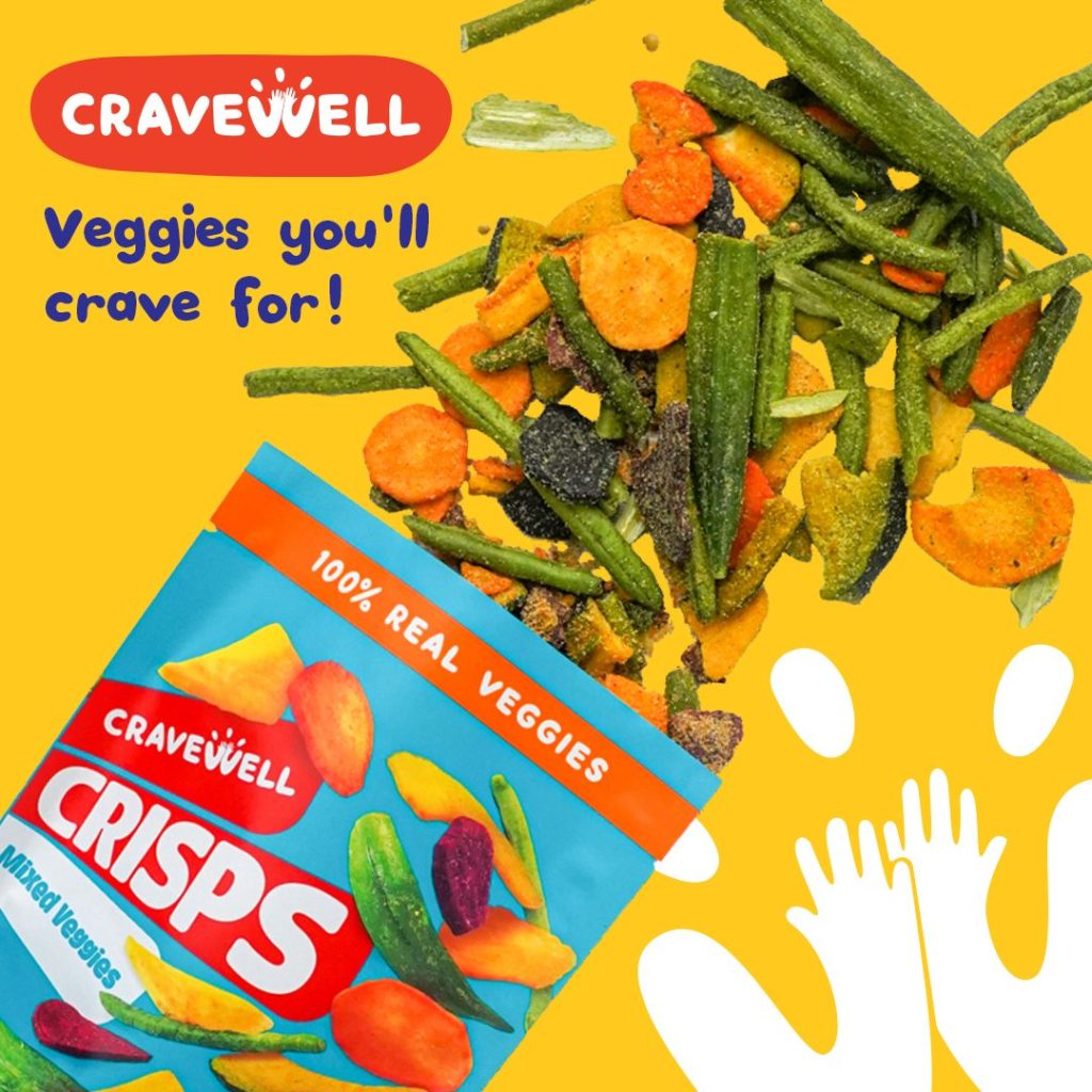
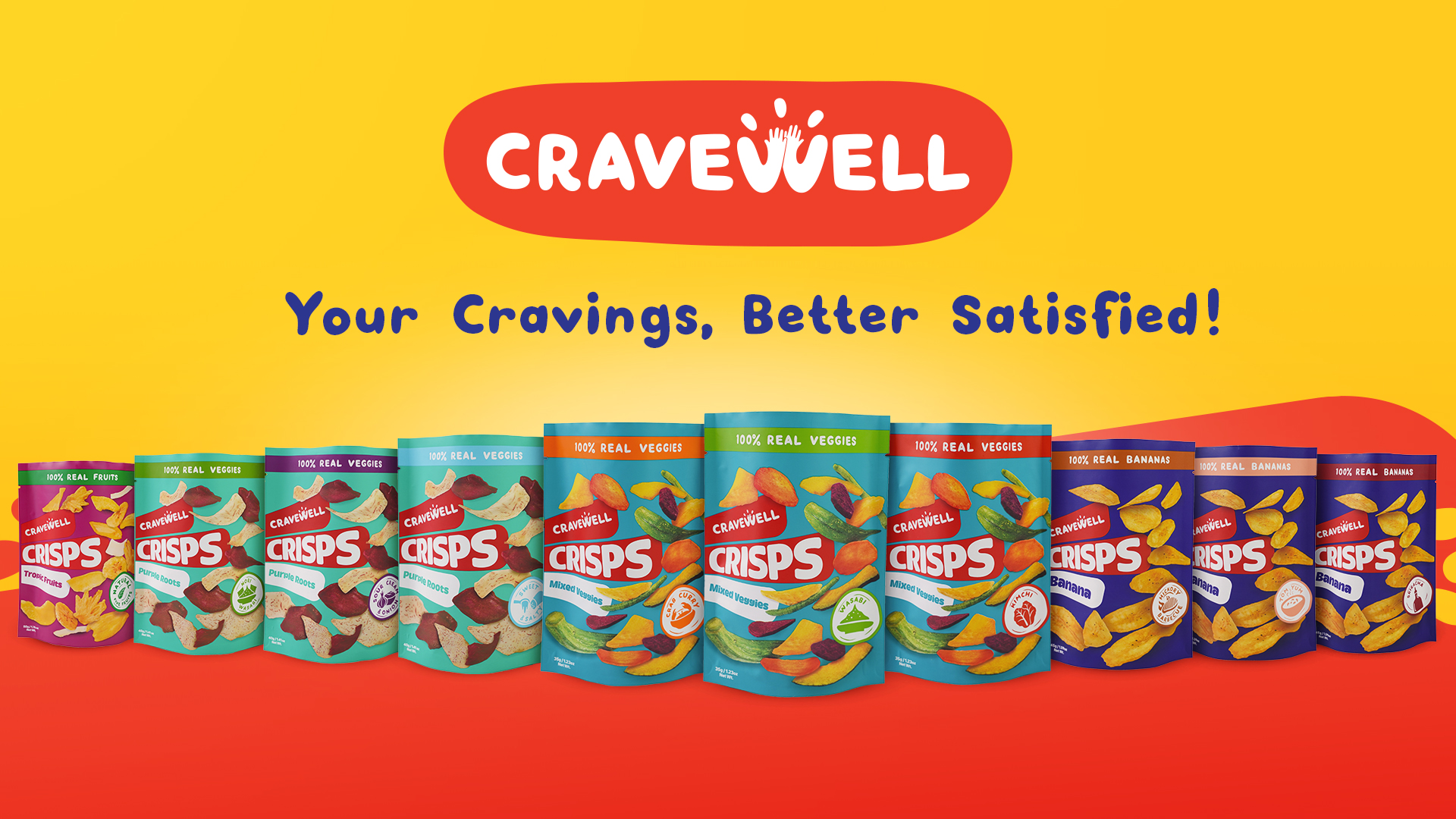
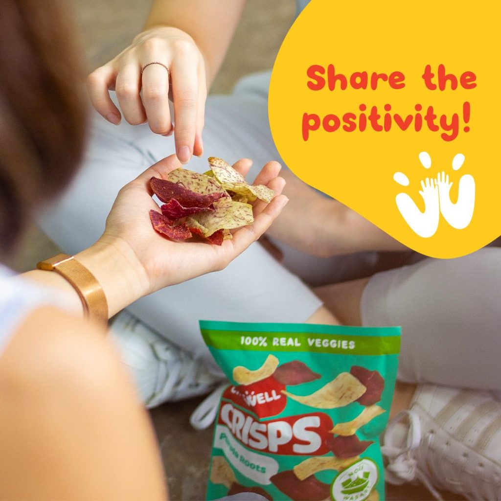
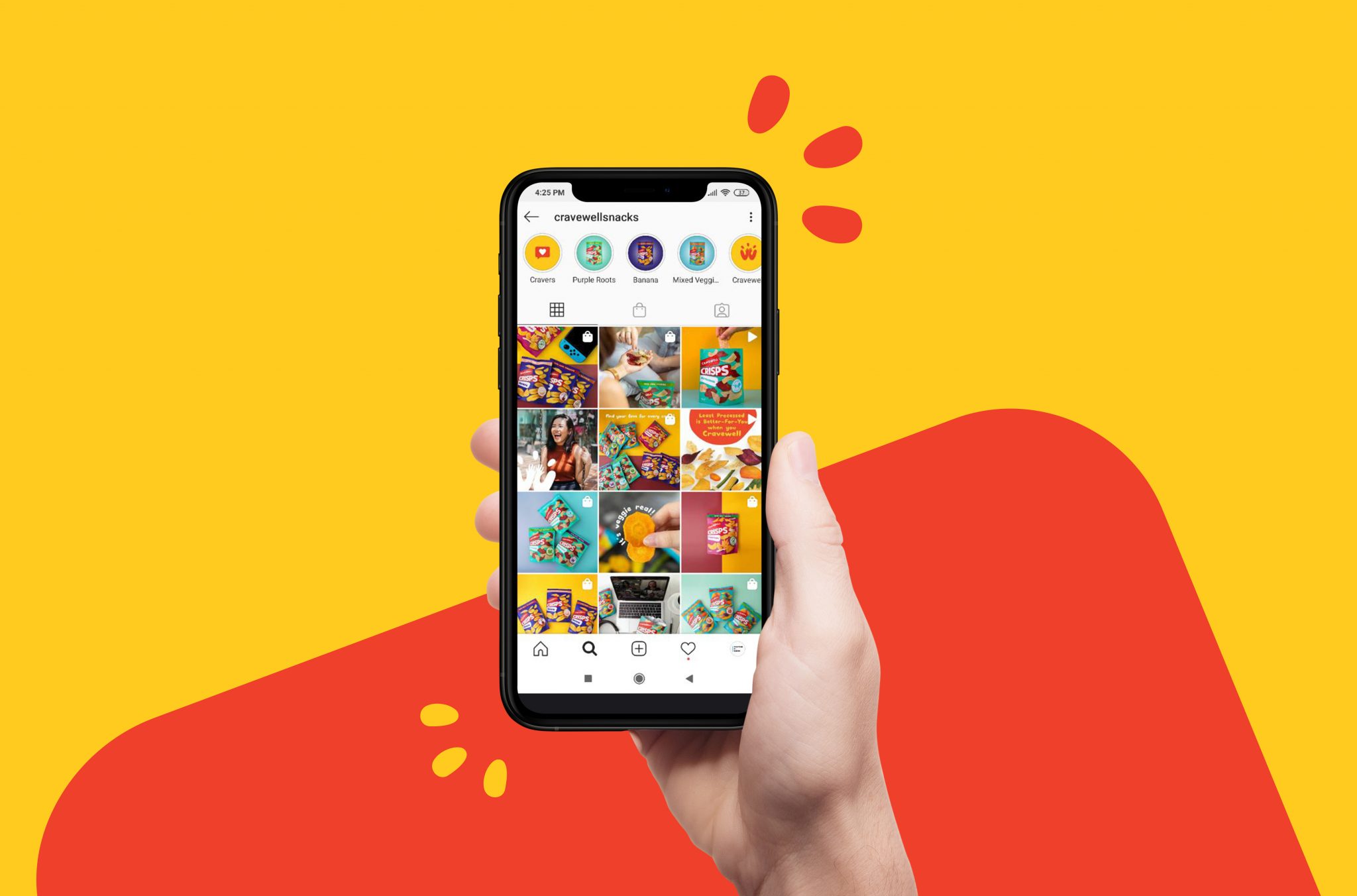
Cravewell