Bawal Sans

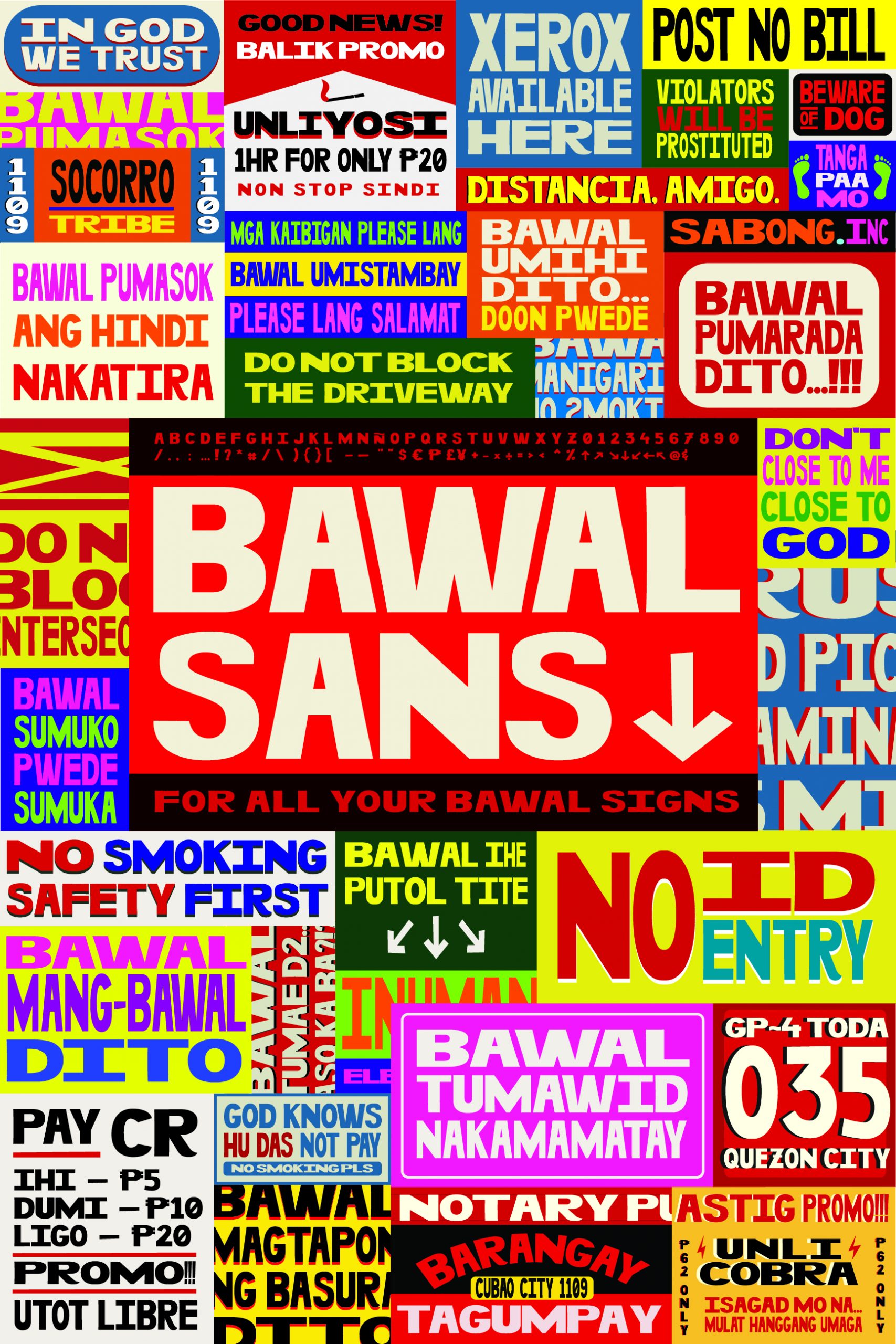
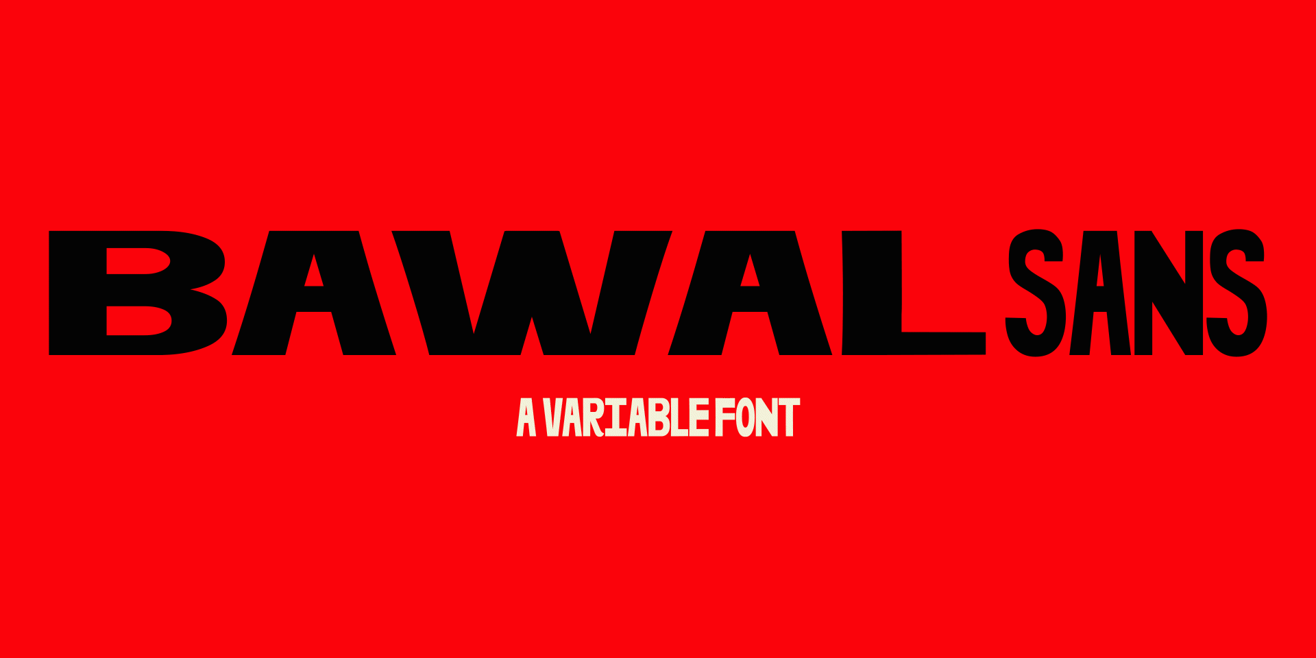
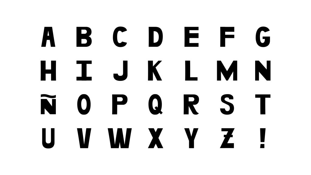
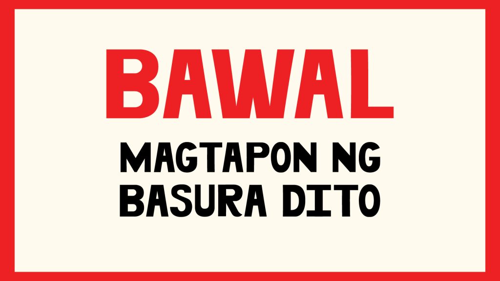
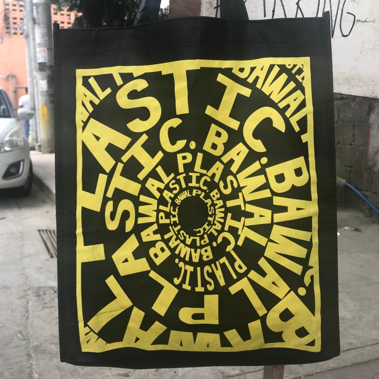
Bawal Sans is a custom typeface created by Together We Design for Tipong Filipino Type Exhibit 2019. Bawal Sans is our homage to our part of the city, Cubao, Quezon City. It is inspired by the d.i.y. signage around our neighbourhood and throughout the metro. The janky letterforms reflect the quickly painted passive-aggressive signs trying to put some order in the city.

👉🏼 See full project here. 👈🏼

John Borras Tan
Animation, Type Design, Creative Direction

Work done with
Together We Design
Lari Gazmen
Mark Gosingtian
Lech Velasco

Bawal Sans averages the look of the DIY signages and reminders we see everyday in the streets to create an actual font system that reflects how we function when we’re in survival mode: fix it now, do it quick, we’ll just make it better with niceties on the next chance we get.

Designed to do one job — getting the message across, loud and clear even from a considerable distance — Bawal Sans is a bold-weight font with flexible width that adjusts to the dimensions of the application, just like the hand-painted signs that inspired it.  And with only capital letters, it retains the passive-aggressive character of DIY signages and reminders everywhere. 

Bawal Sans is a variable font with flexible width that adjusts to the dimensions of the application, just like the hand-painted signs that inspired it. It can go from Ulta Condensed to Ulta Expanded and anything in between. And with only capital letters, it retains the passive-aggressive character of DIY signages and reminders everywhere. While the letterforms are very basic with almost no design system, the font is itself a visual language — one that’s so direct and explicit that it leaves no room for question or doubt, and it eliminates the need for repetition, no matter the message.